Electricity Maps
5 நட்சத்திரங்களுக்கு 5.0 (1 மதிப்பாய்வின் அடிப்படையில்)


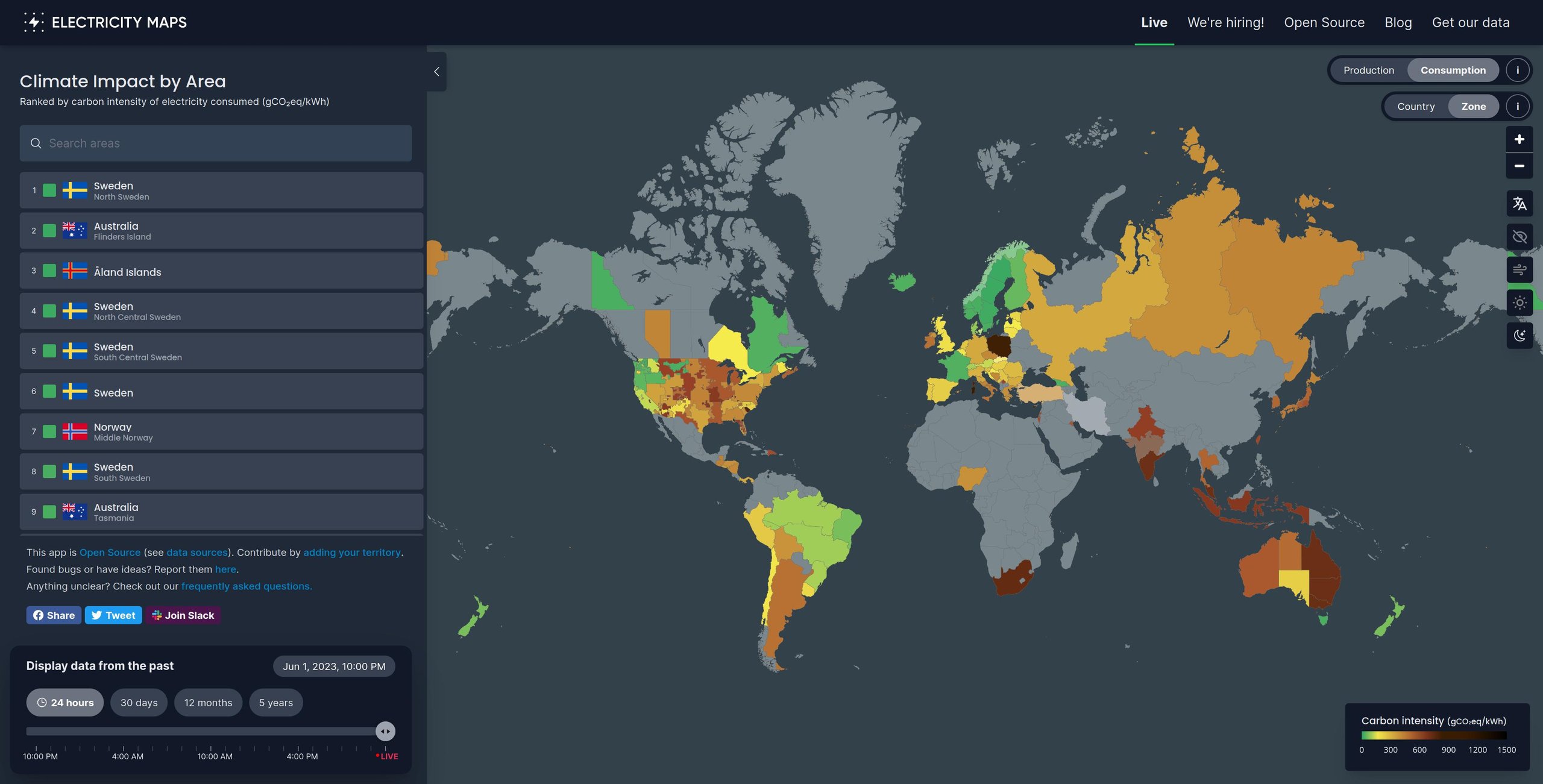
This project aims to provide a free, open-source, and transparent visualisation of the carbon intensity of electricity consumption around the world. We fetch the raw production data from public, free, and official sources. They include official government and transmission system operators’ data. We then run our flow-tracing algorithm to calculate the actual carbon intensity of a country’s electricity consumption.
There’s a usage tracker on the website, but according to their website they do that by not collecting “personal data or personally identifiable information (PII), without using cookies and while respecting the privacy of your website visitors.” (https://plausible.io/privacy-focused-web-analytics).